- 2 Posts
- 21 Comments
Thanks! I had a hunch I was missing it. I thought it was a share button, which in retrospect made no sense.
Done. Fingers crossed.
I didn’t get one either. :(
I’m all registered for the notifications. Notify me if you dare!
This definitely sped up thumbnails for me (unless it’s a placebo effect).
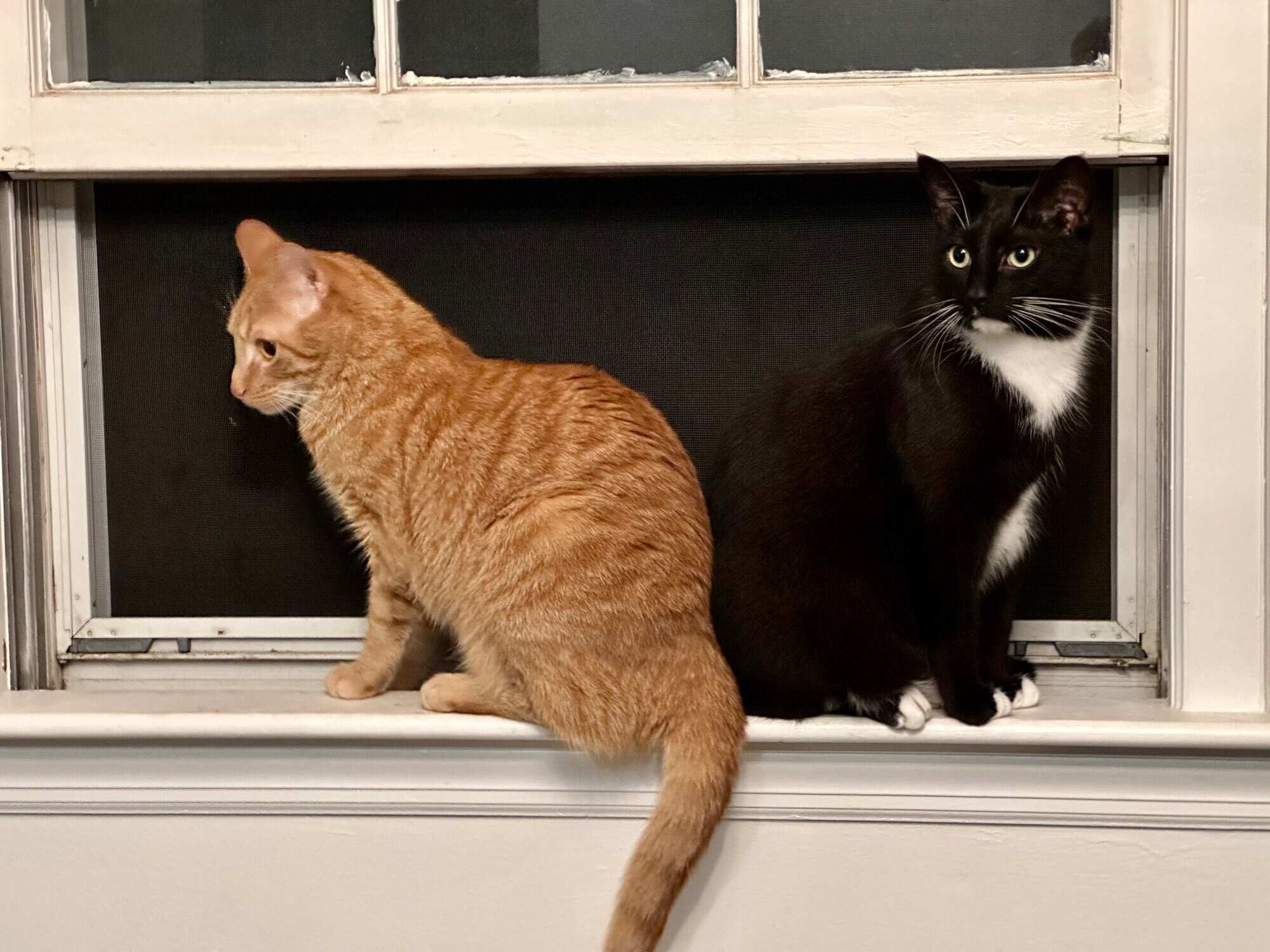
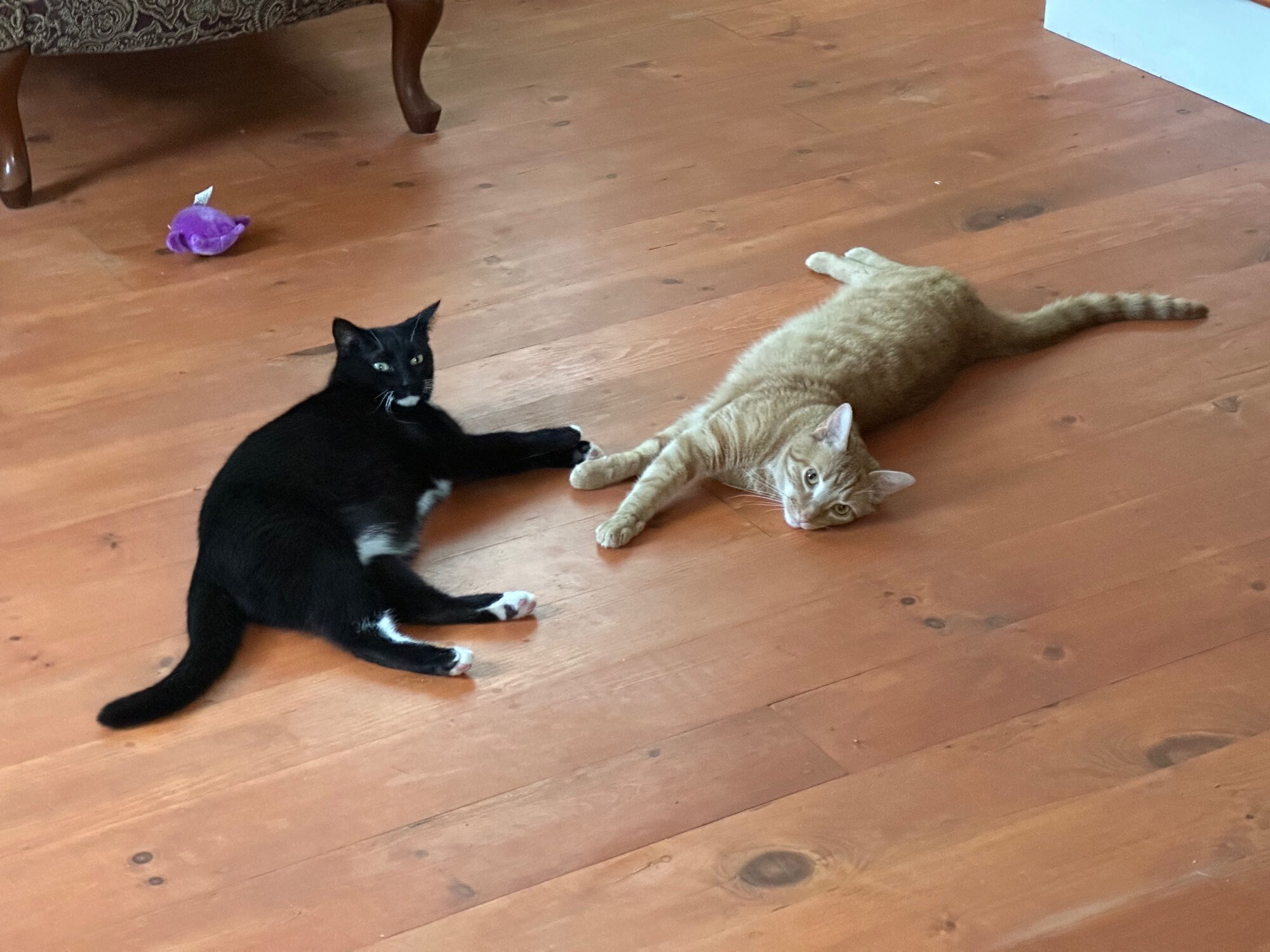
Thanks. They are barely grown up. Xander (orange) is 1 and Xedo (tuxedo) is 1.5.
One more because the orange cat doesn’t look very orange in the first…

Ask and ye shall receive!

I love the toebean icons in this new build. You have one for each of my cats! So far so good with the scrolling too.
Another vote for Beanpods!

 8·1 year ago
I’m an American and this stuff has always bothered me. I do hate having my drink empty, but I don’t need a refill when I have half left either.
Since I didn’t get the previous build via TestFlight, I’ve got a request on one of the changes from that one: Can we get some haptic feedback for the press and hold pop up account changer? For some reason, it feels like it should be there to me.
New build showed up for me.
Just checked out the new build. Much better with the subscriptions. The fact that you have a plan to improve it even more is icing on the cake.
For the community selector, would it be possible to have it list your subscribed communities so you don’t have to search for them? Searching for communities using certain keywords yields a huge list of results that makes it slow to find the ones I subscribe to.
The error it gives me when I use the mobile site is that my images are too large. I’m betting that it’s either a generic error because they don’t actually support images, or they have the limit set so low that it’s effectively disabled.
Maybe the best thing is to pass on any error messages the server gives the user trying to upload?

 20·1 year ago
This is what the community should and needs to be like.


Thanks. Also maybe a slide to delete gesture on the accounts list?