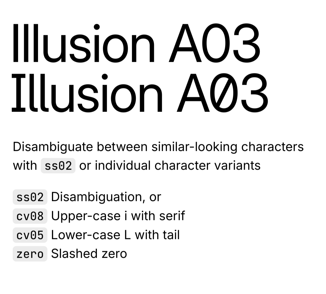
The Inter typeface is very versatile and has many different options and variants, including more distinguishable uppercase i and lowercase L. The article just installed the base version as an example. https://rsms.me/inter/ 
Maxx
- 0 Posts
- 3 Comments
Joined 1 year ago
Cake day: August 5th, 2023
You are not logged in. If you use a Fediverse account that is able to follow users, you can follow this user.
GNOME. A lot of people customize it to look and behave more like Windows or Macos, and I used to as well, but after giving the default configuration a chance and getting used to it, I prefer it over everything else. It’s way more focused and organized, and I can navigate through my open windows quicker and easier. It’s just a different workflow you need to adjust your brain to.


Okay