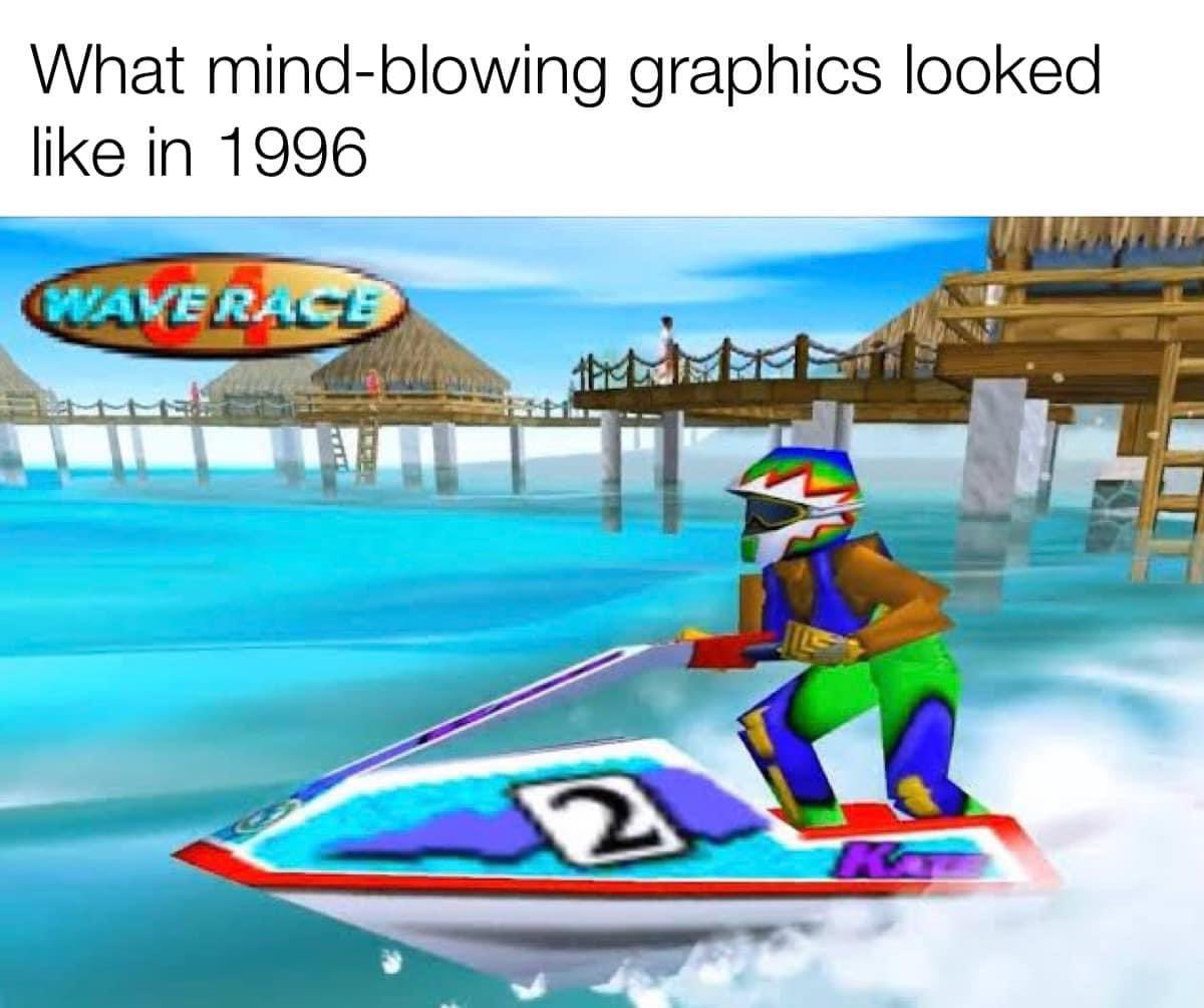
This was shit graphics even back in 1996 because it only uses primary or fully saturated colors. It’s “dev art”, made by someone with no artistic talent. Or maybe made for 4 year old kids. I missed out on a lot of games with good gameplay because I just can’t stand on this abomination of a color palette.
The worst thing? When games actually went with a more pastel or naturalistic color palette, moronic games journalists would say the colors look “drab” or some shit.
I just want to comment to say realism is not good graphics, even if that’s all the AAA studios aim for because the executives have no artistic sense. I don’t think that’s what you’re saying, but just looking more “real” doesn’t make it better. Vibrant saturated colors have a utility too, if they’re used well.
…so you’ve never played waverace: that’s the look of the brightly-lit tropical island environment for the first course, which immediately shifts a hazy muted marsh on the second course, then a stormy industrial-port waterfront, then a spectacular urban night course, each presenting entirely different takes on ambient lighting, dominant environmental color pallets, and even water and atmospheric weather conditions…


This was shit graphics even back in 1996 because it only uses primary or fully saturated colors. It’s “dev art”, made by someone with no artistic talent. Or maybe made for 4 year old kids. I missed out on a lot of games with good gameplay because I just can’t stand on this abomination of a color palette.
The worst thing? When games actually went with a more pastel or naturalistic color palette, moronic games journalists would say the colors look “drab” or some shit.
I just want to comment to say realism is not good graphics, even if that’s all the AAA studios aim for because the executives have no artistic sense. I don’t think that’s what you’re saying, but just looking more “real” doesn’t make it better. Vibrant saturated colors have a utility too, if they’re used well.
Something like AER memories of old?
Not to advertize, it just came to mind. I quite liked it.
Yeah but thats a newer game and im pretty sure this post is about 90s games
You’re a wacky little guy, aren’t you?
…so you’ve never played waverace: that’s the look of the brightly-lit tropical island environment for the first course, which immediately shifts a hazy muted marsh on the second course, then a stormy industrial-port waterfront, then a spectacular urban night course, each presenting entirely different takes on ambient lighting, dominant environmental color pallets, and even water and atmospheric weather conditions…